GrindScape Logo
GrindScape
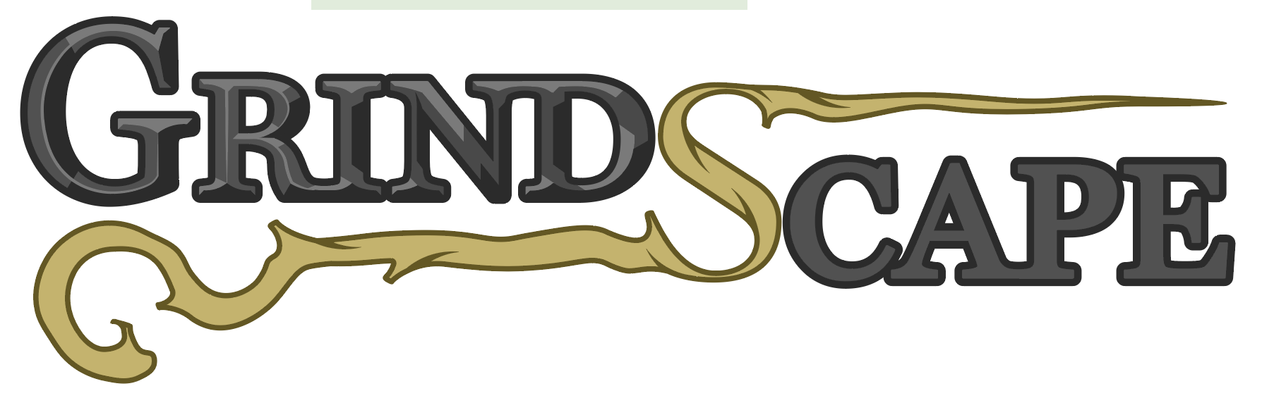
As part of the brand identity for GrindScape, an indie game currently in early development, I designed a 6-color logo that captures the game’s thematic tone. The logo combines bold typography in a carved stone style with twisted wood wrapping through the ‘S’ to evoke the mysterious, magical atmosphere of the game’s world.
This project demonstrates my ability to translate a game concept into a cohesive visual identity that communicates mood, tone, and intent. It highlights my skills in graphic design, branding, and vector illustration, as well as my ability to create assets that complement narrative and gameplay.
The GrindScape Logo was a project that applied my skills in graphic design, branding, and digital illustration. Using Adobe Illustrator, I crafted the initial 6-color vector design to reflect the game’s mysterious atmosphere. This version of the logo is meant to serve as an early placeholder for social media accounts, as well as a print-ready version for physical media. Looking ahead, I plan to refine the logo’s definition in Photoshop for a full-color, polished version to be used in-game and across website pages.
Logo Concepting
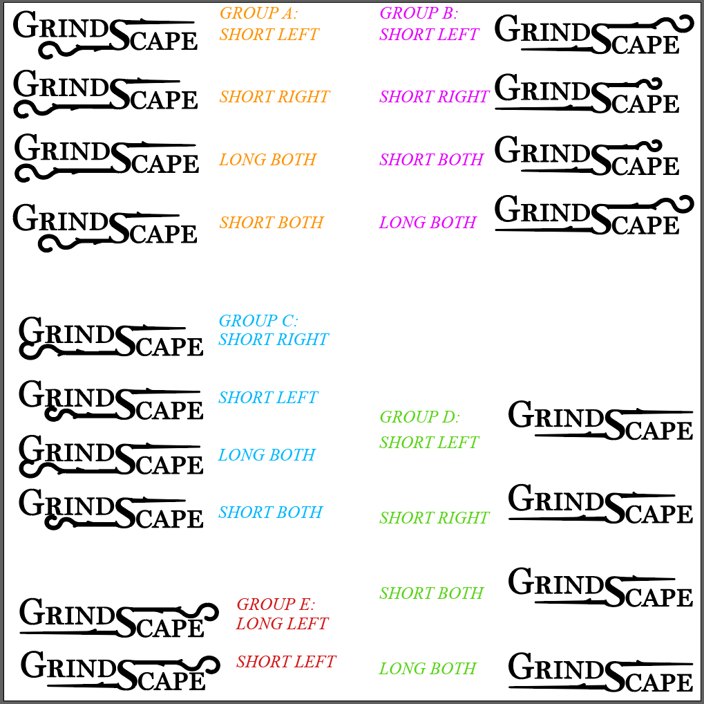
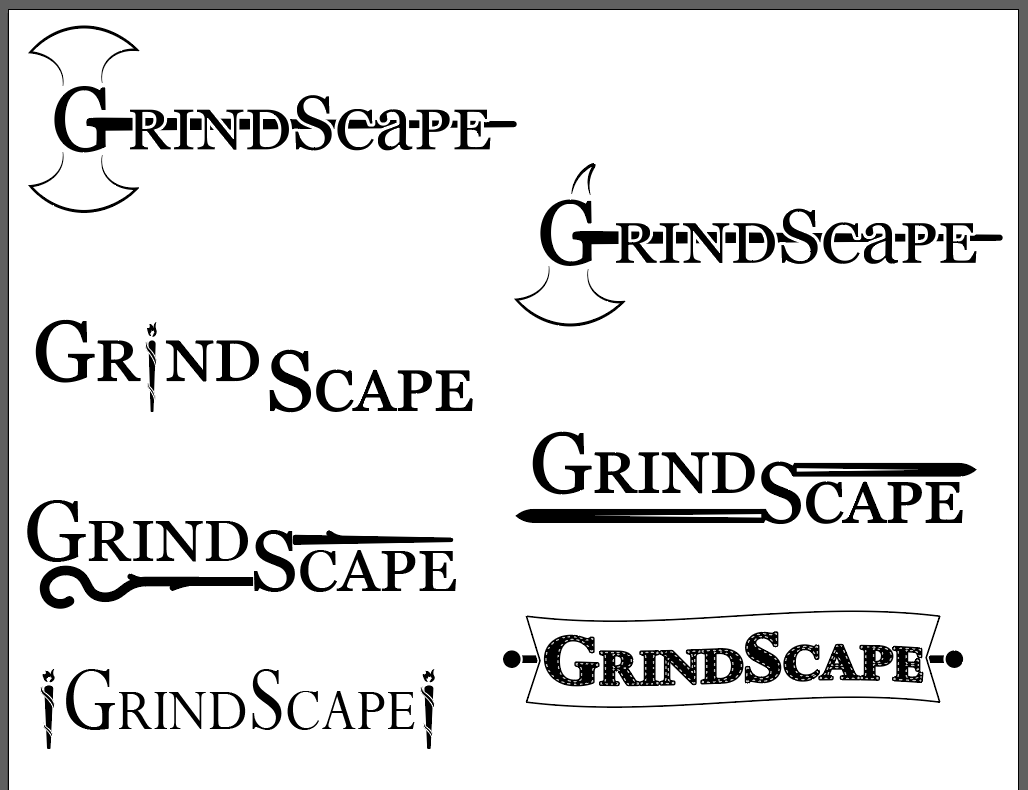
During the concept phase for the GrindScape logo, the design direction focused on incorporating weaponry into the visual identity to reflect the game’s combat-driven themes. Multiple weapon silhouettes were considered as part of the logo’s symbolism. After exploring different possibilities, the team selected a magic staff as the defining element.
The staff provided a strong visual centerpiece while reinforcing the fantasy elements of the game world. Integrating this motif into the overall composition helped create a logo that communicates the gameplay and tone.
Looking Ahead…
Future work will focus on adapting the design for use across digital platforms. This includes creating optimized versions suitable for small-scale applications such as social media profile images, favicons, and in-game UI elements. This stage will emphasize scalability, ensuring the brand remains clear across a variety of platforms and screen sizes.
Design Refinement
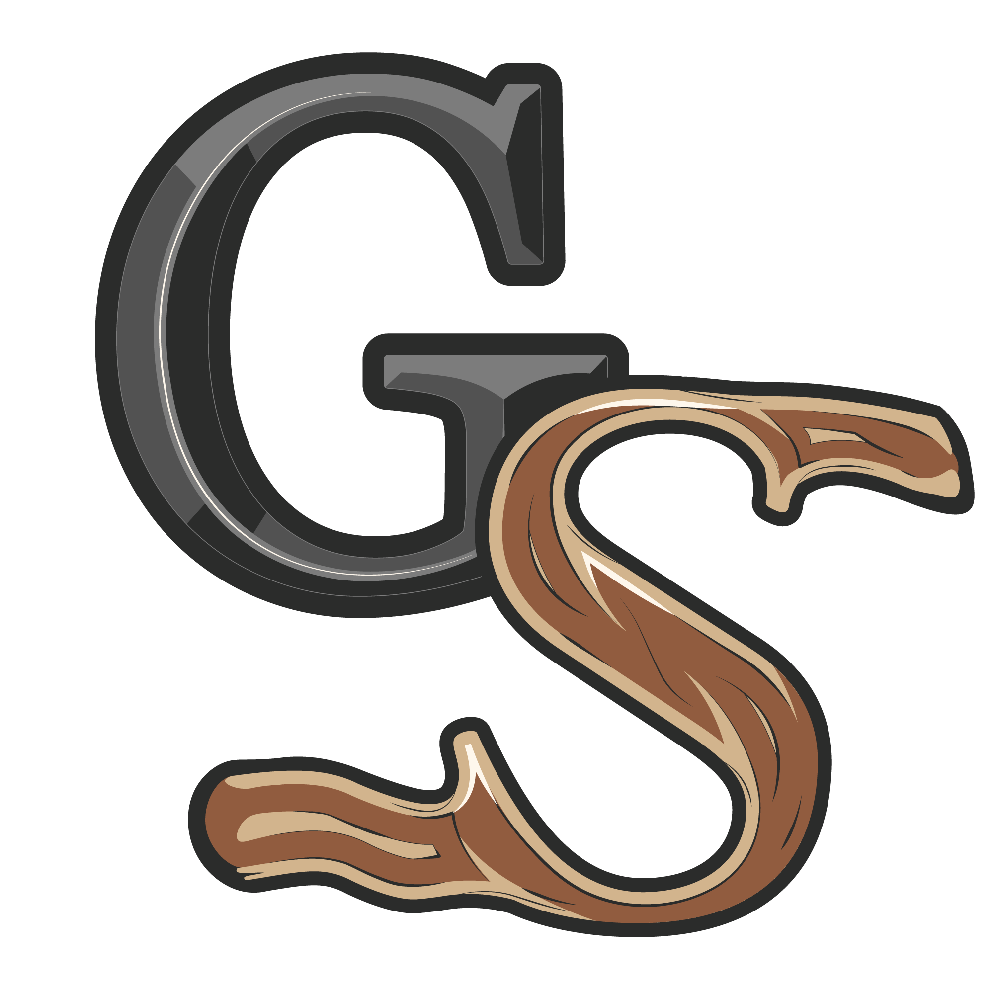
As the GrindScape logo progressed, the design was transferred into Adobe Photoshop for detailing and visual polishing. During this phase, adjustments were made to smooth and soften the original vectors, giving the carved stone lettering a more rounded chisel appearance.
Additional work focused on improving the realism of the staff element and introducing subtle ethereal visual effects to create a sense of magical energy. These refinements added depth and visual interest while helping the logo better communicate the fantasy tone of the universe.