Documentation and Branding
Y AND J FURNITURE
DURHAM, NC
In 2019, I was commissioned by Y and J Furniture Company, a small furniture repair business, to complete several projects aimed at enhancing their operational and branding materials. This collaboration resulted in a comprehensive annual report and updated set of stationery, both of which significantly improved the company's internal and external communications.
These projects for Y and J Furniture Company exemplify my ability to merge functional design with aesthetic appeal, ensuring that essential business documentation is both accessible and visually engaging.


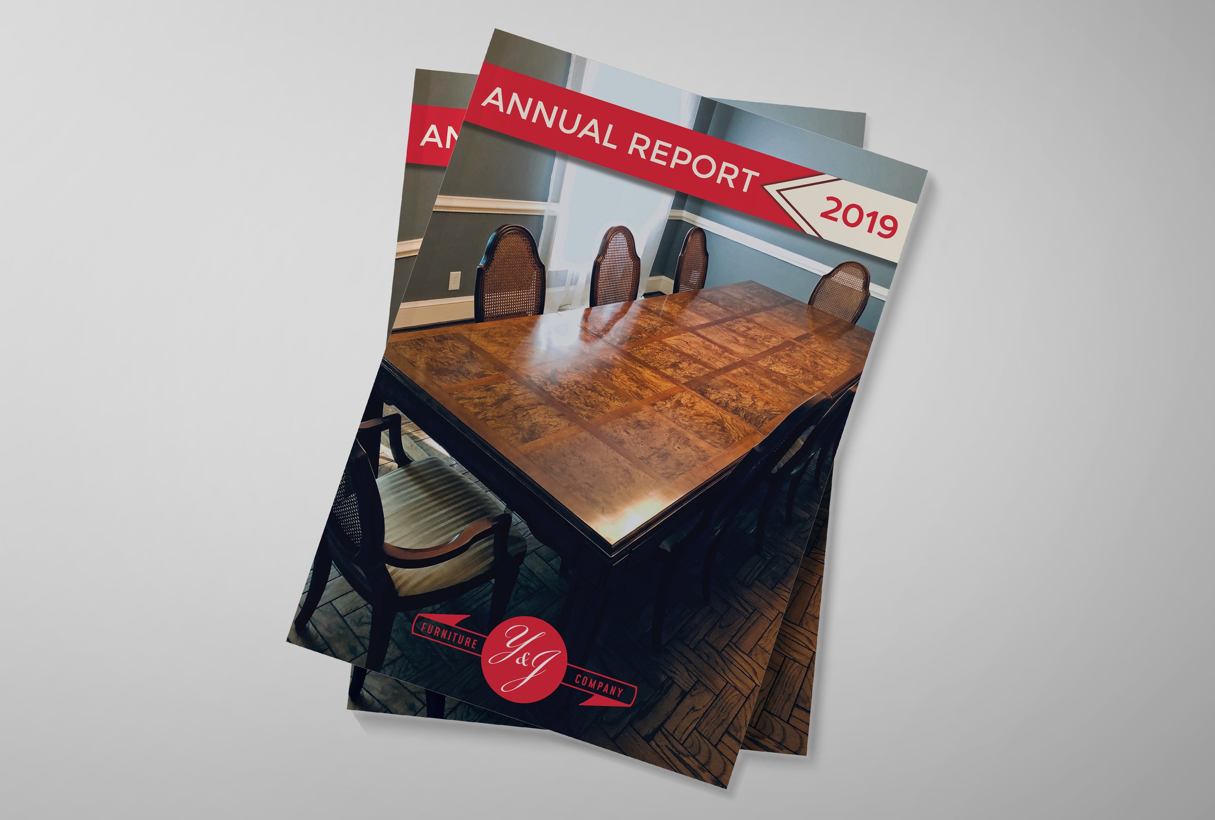
Using Adobe Illustrator, I designed a refined vector logo in both color and black-and-white versions, allowing versatility across various print and digital mediums. I then used Adobe InDesign to develop custom work orders, stationery, and an annual report. The report featured visually engaging layouts, including graphs, historical imagery, and customer testimonials, making complex financial data more accessible.
Annual Report
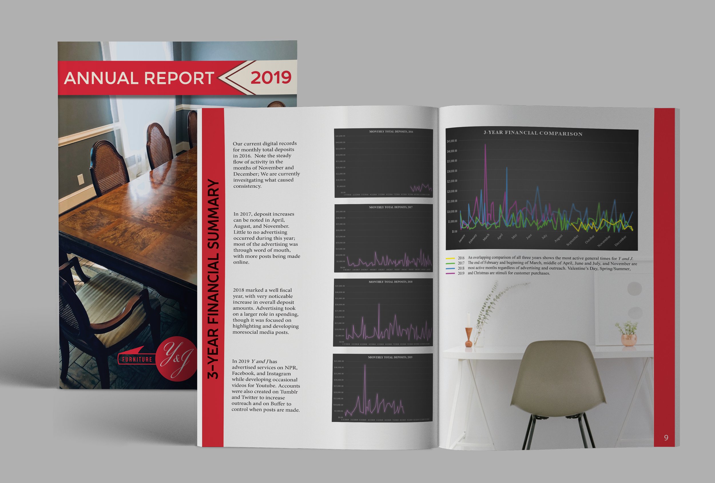
Y and J Furniture Company required a more effective way to view their fiscal year as they approached 2020. I developed a report template that displayed their expenses in an easily understandable manner. This involved compiling months of written deposit reports to create clear, informative graphs.
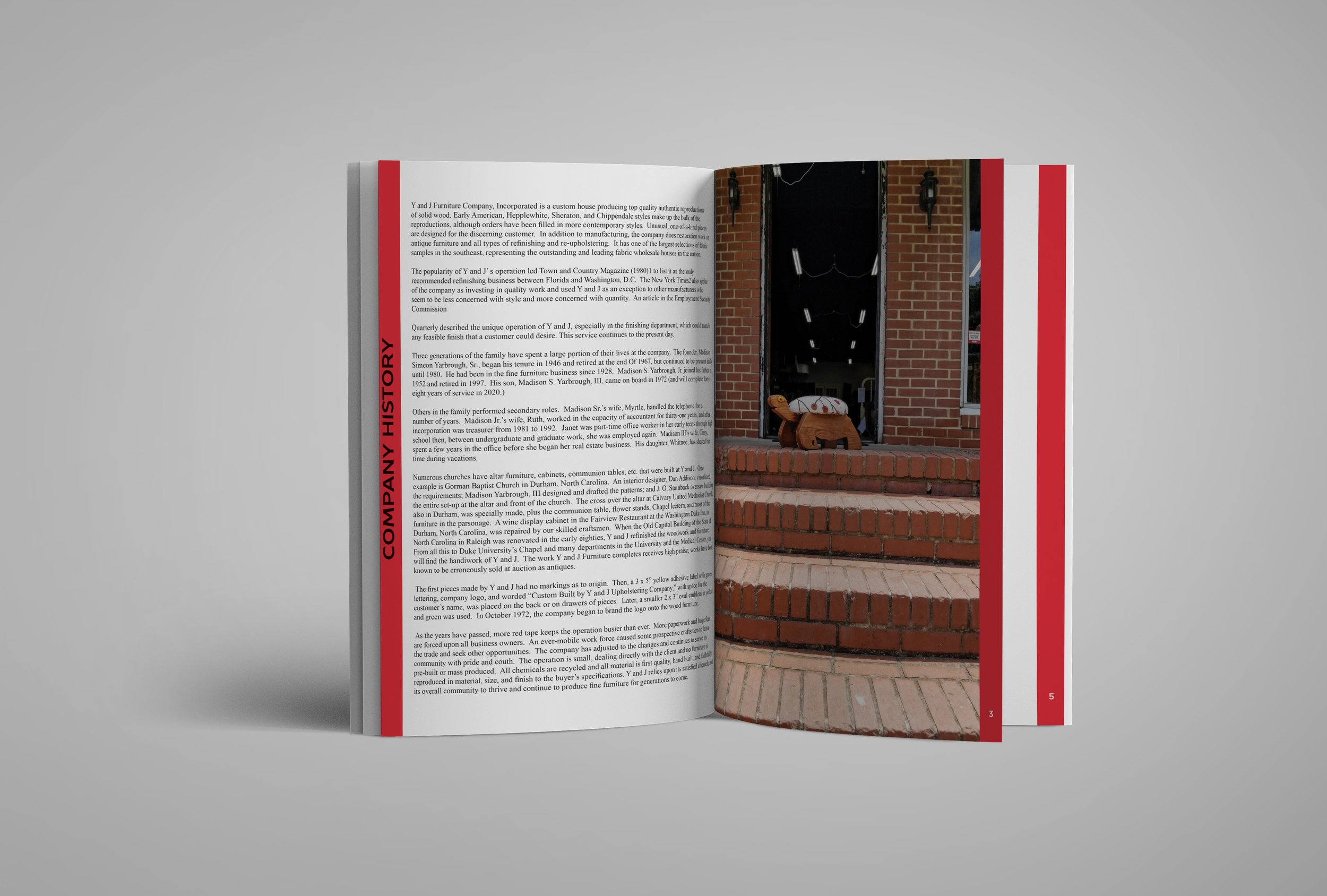
The annual report, representing the previous year’s fiscal data and tax information, featured these graphs to simplify complex financial numbers. It also included historic and modern images of the 74-year-old company, photographs of current and past presidents, Polaroid and digital images of repairs, and testimonials from both new and repeat customers. As the first visual representation of their annual report, it not only made financial information more accessible but also celebrated the company’s rich history and customer satisfaction.


Updated Stationery
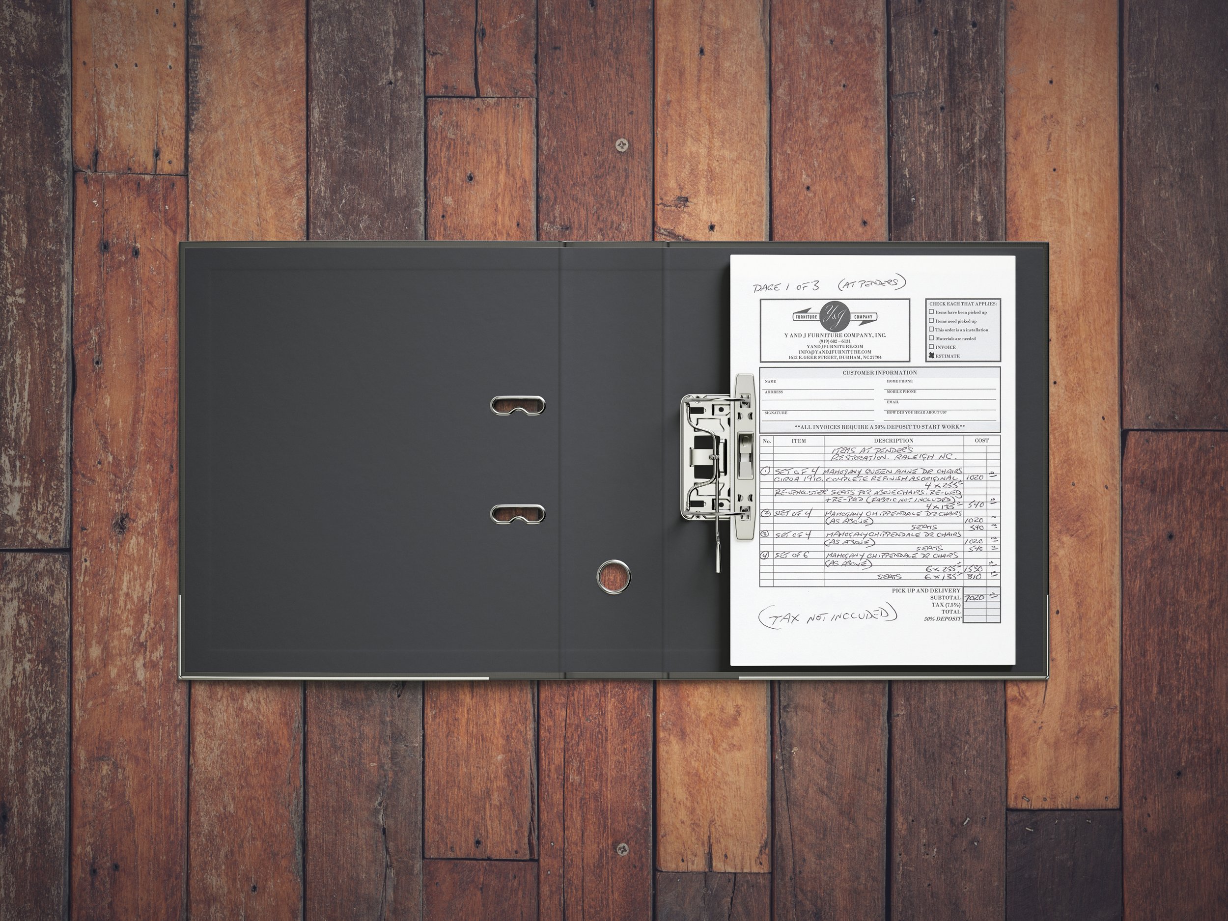
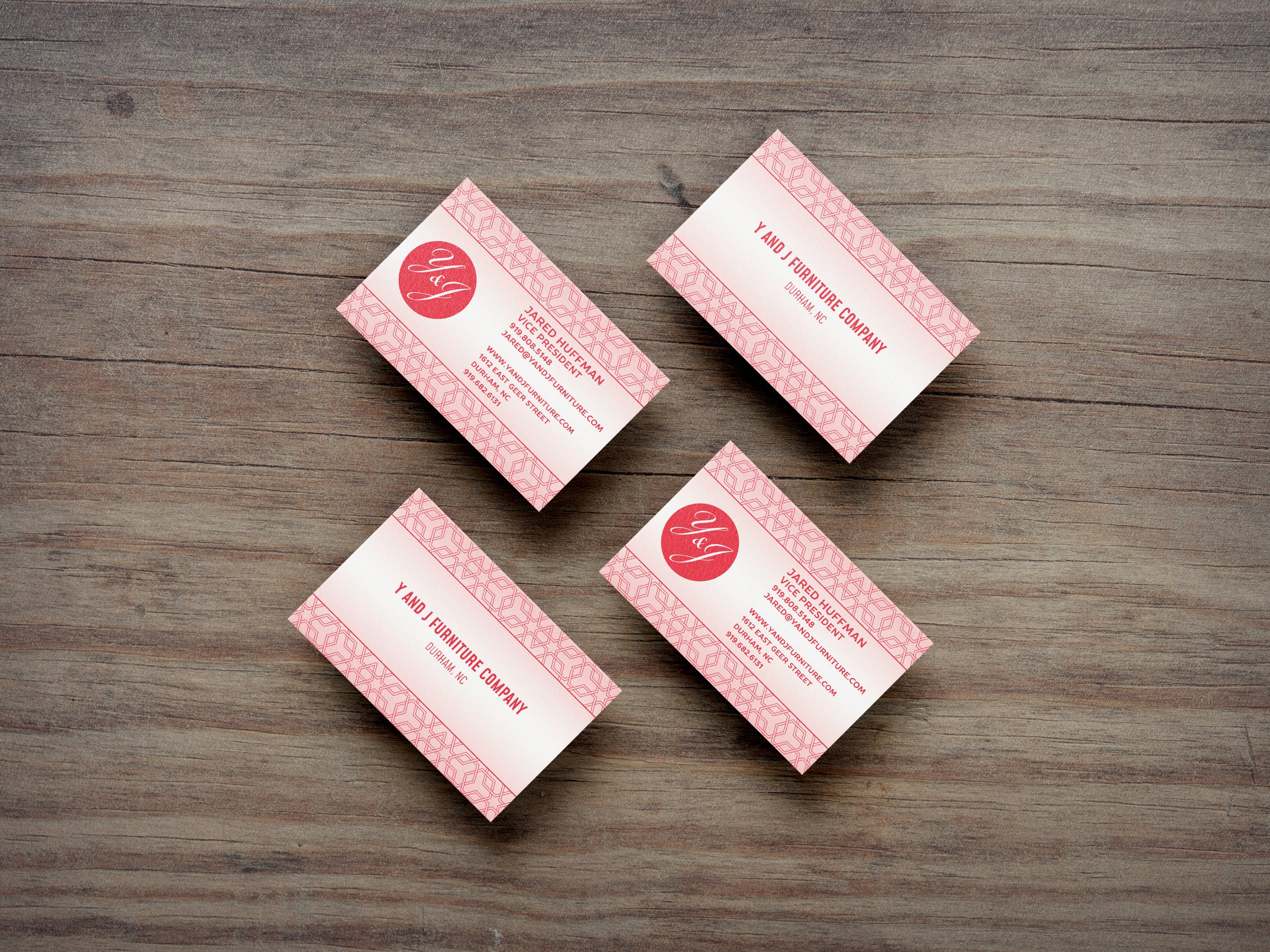
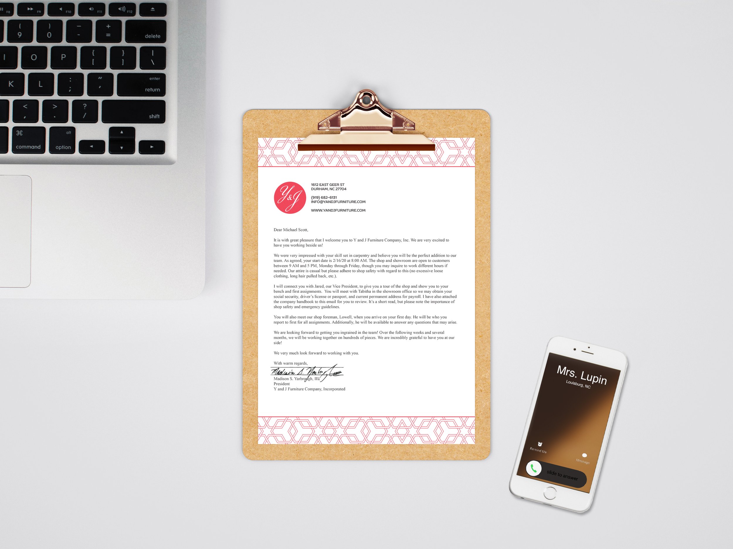
The company also requested a modernization of their stationery, including work orders, business cards, and envelopes, which had not been updated in about a decade. The owner desired a design that maintained the essence of their original logo while introducing a modern look. I minimally altered the logo by removing its ovular outline to adapt it for a grid setting, both preserving the brand’s legacy and refreshing its appearance. The new stationery design retained the company's traditional branding elements while presenting a contemporary, professional image.